
The Waiting Room Starts On The Homepage.
Taking a private-practice therapist from zero online presence to a live site built to earn trust before it asks anything of an anxious visitor.
Scroll to begin ↓"The hardest thing to design isn't a layout. It's the moment a hesitant person decides whether to reach out, or close the tab."
The Problem
My client, a solo private-practice therapist, had no website at all. Every new patient came through word of mouth, and there was nowhere online for someone to learn what she treated, decide if she was a fit, or figure out how to reach her.
That gap mattered more than a typical small-business site problem. The people landing on a therapist's site for the first time are often anxious, hesitant, or in crisis. They aren't comparison-shopping a service so much as deciding whether to trust someone with something difficult. So the site needed to earn trust before it asked for anything.
Research & Discovery
There was no patient interviewing, no survey, no analytics to mine, since the practice had no digital footprint yet and nothing to measure. What I had instead was direct, recurring access to the one person who understood the audience best, my client herself.
We met weekly over Zoom for the life of the project. It wasn't a single intake call but an ongoing brainstorming cadence. Each session, I brought design questions and rough direction, and she brought her read on what mattered to the people who'd be landing on this site, drawn from years of sitting across from them.
That input was real, but limited in a specific way, it was her general impressions of patients, not documented patient feedback. I treated it as informed stakeholder discovery rather than a substitute for talking to users directly, and that distinction shaped how much weight I put on any one opinion versus my own judgment as the designer.
Define & Ideate
One disagreement defined this phase. My client's instinct, based on her sense of her patients, was that a hesitant visitor needed to see her services first. I saw it differently. Someone arriving anxious isn't ready to process a clinical list in the first five seconds. They're scanning for an emotional signal first, something closer to does this feel safe?
"Show services first, what I treat, who I work with. That answers 'is this person right for me?' fast."
Lead with tone and trust, and let services follow once the emotional bar is cleared. One click away, not page one.
Trust before information, for an audience whose primary barrier isn't confusion, but hesitation.
Design Decisions
Wireframes first
Before any color or copy went into the GoDaddy builder, I blocked out all four pages at low fidelity, a plain hero block, a gray portrait placeholder for the about page, gray placeholder text, a bare list of services, a stripped-down contact layout with the map called out as a single box. Those wireframes were what I actually brought to the weekly calls, so my client and I were agreeing on structure, where trust needed to be earned, where services should sit, before either of us judged anything on color or photography.
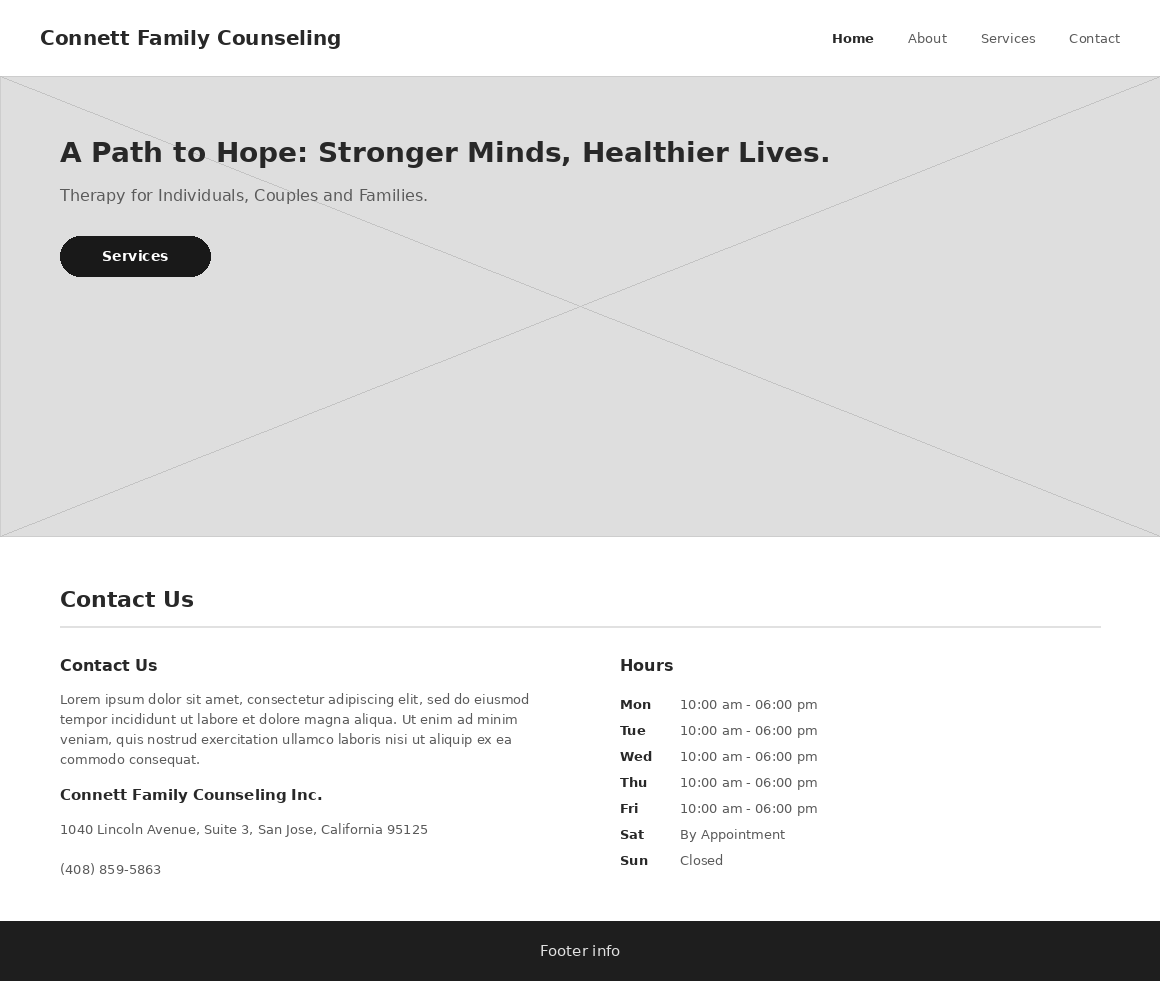
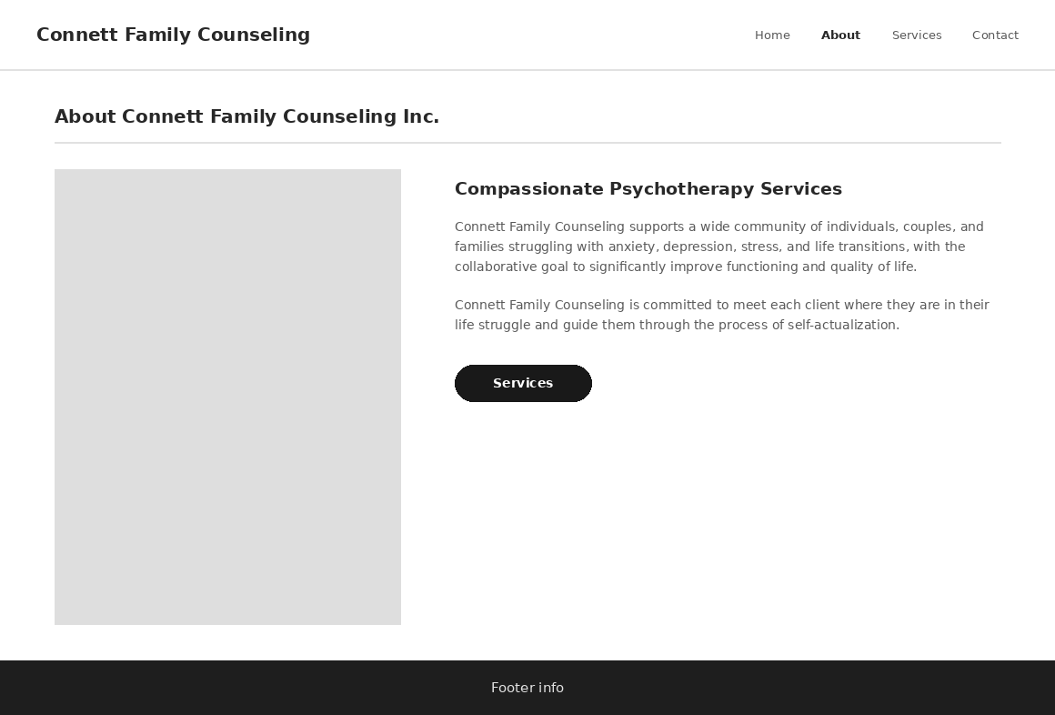
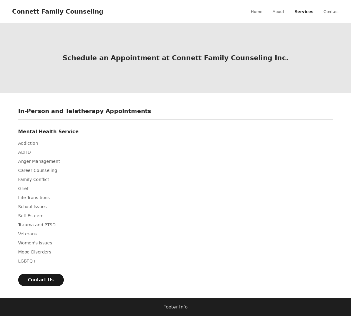
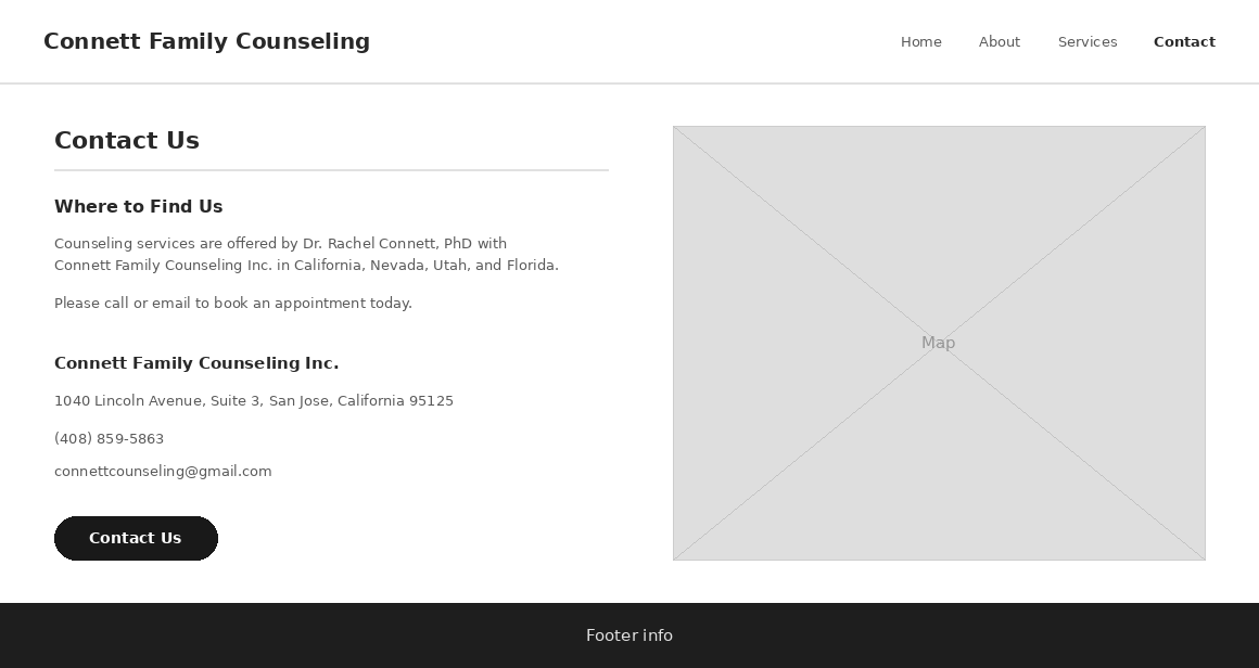
Home, About, Services, and Contact, worked out in gray boxes before any real copy or imagery existed to fill them in.
Information architecture
Four pages, deliberately minimal: Home, About, Services, Contact. Anything more would have added decision fatigue for a visitor who is already hesitant. Every page carries one clear next action toward Services or Contact, never two competing calls to action on the same screen.
Visual tone
The calming blue palette and typography were chosen specifically to read as low-stimulation, the opposite of a clinical or corporate feel. This was the most deliberate lever I had to support the trust-before-information decision above: the page has to feel safe before it says anything.
Resolving the stakeholder tension
Rather than picking a side and dropping it, I kept her instinct intact. Services information stayed complete and easy to find, but I moved it a layer deeper than page one. That way, an anxious visitor isn't confronted with a clinical list before they're ready, and a visitor who is ready can still find exactly what she treats in one click.
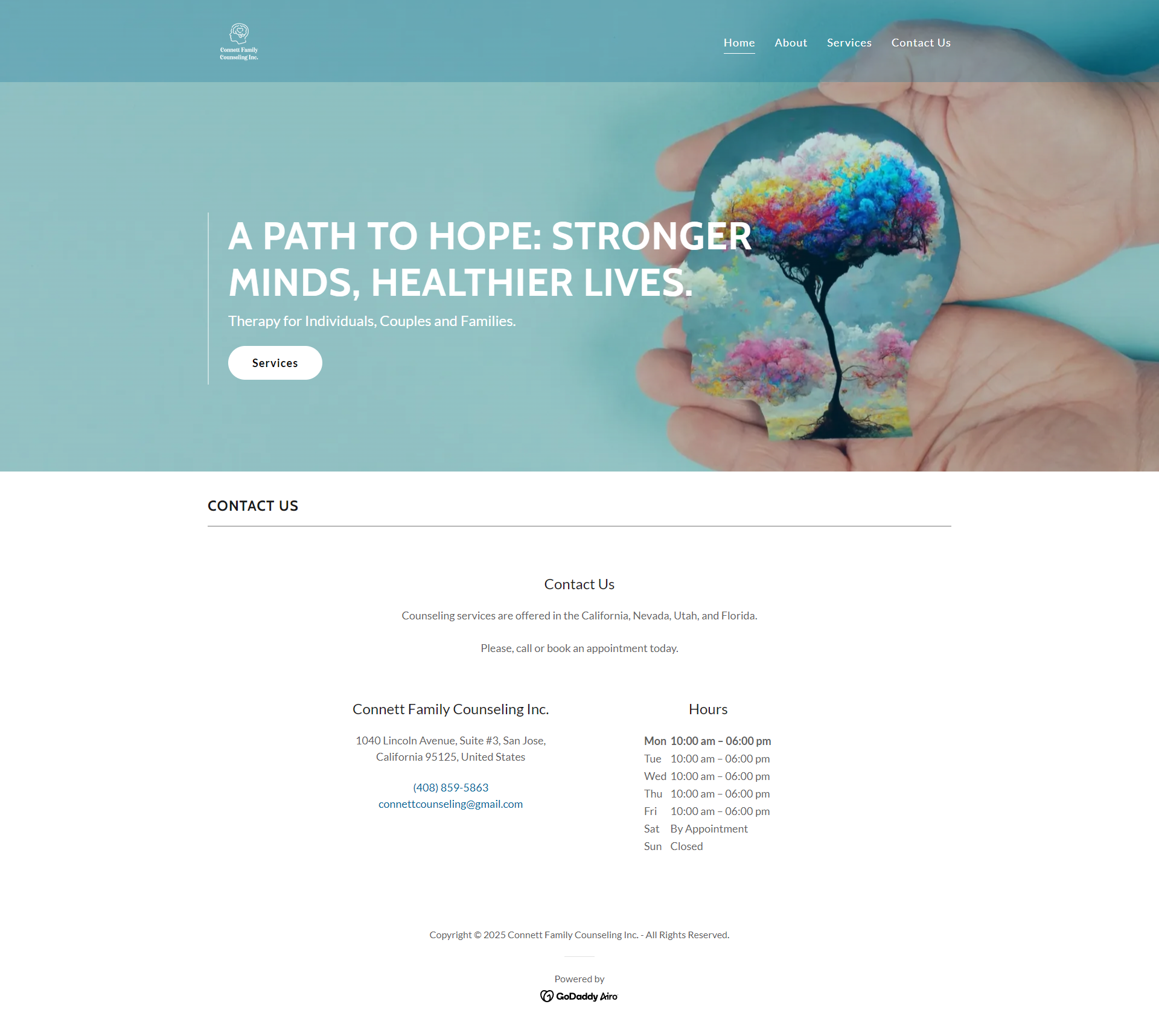
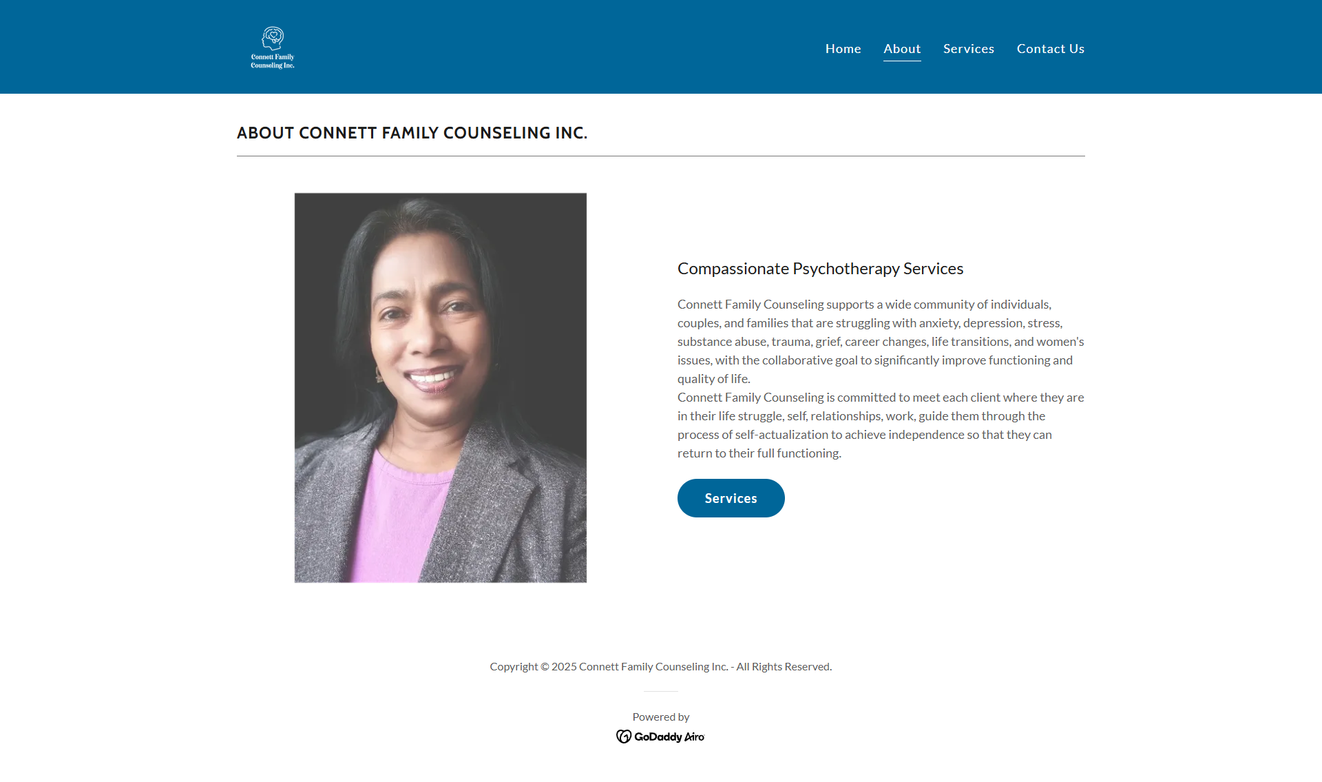
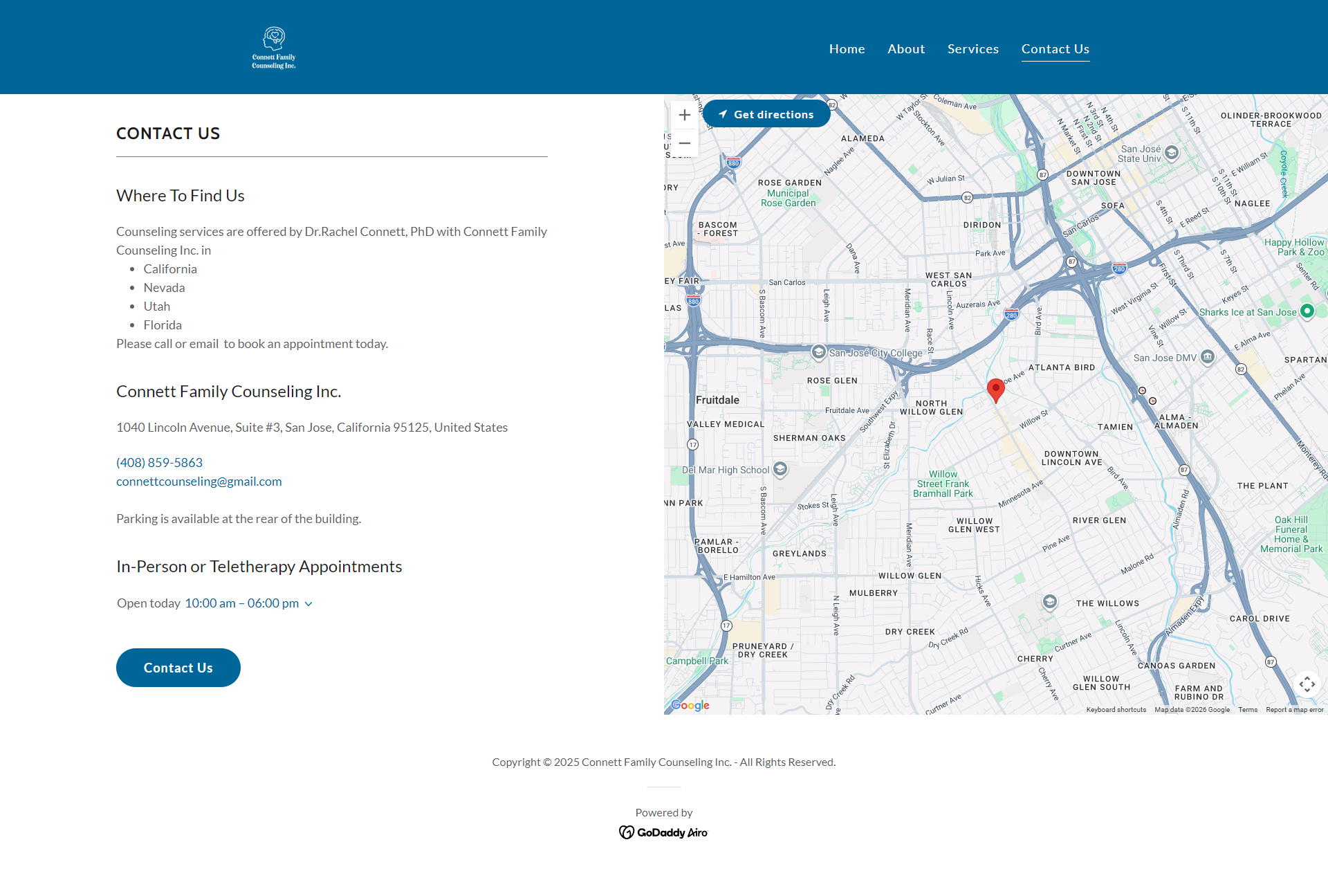
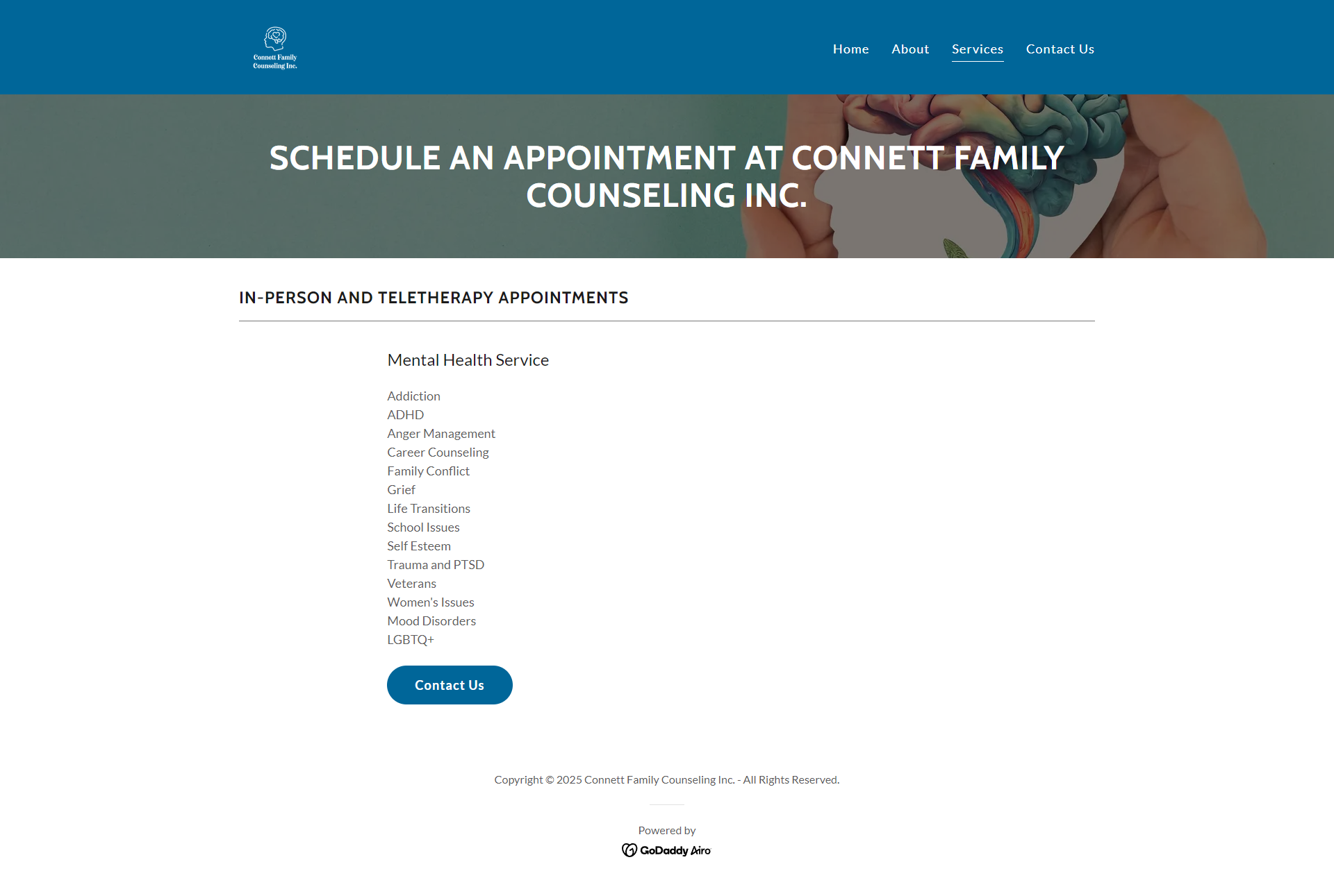
Where This Landed
I don't have a measured outcome for this project. No inquiry counts, no booking data, no follow-up survey. What I have is that the site shipped, has been live since spring 2025, and my client is still using it as her practice's primary online presence. I'd rather flag that limitation directly than imply a result I can't back up.
What I'd do differently: ask her to gather patient feedback, even informally, with a quick question like "how did you find us, and what almost stopped you from reaching out," instead of relying on her general impressions. That single change would turn a stakeholder opinion into real evidence, and it would tell me whether the trust-before-services bet paid off, instead of leaving it as a decision I still believe in but can't prove.